Friday, July 12, 2013

The Art of a Sketchbook - Friday

Negative drawing....

 I think I was working through Betty Edwards book Drawing on the Right Side of the Brain when I did these negative drawing sketches.

Definition: Negative space is the area of an image not occupied by shapes or forms. This part of the drawing is often neglected, or filled with casual scribbles. Negative space drawing involves concentrating on drawing the background, leaving the object white - an excellent exercise in observation.

I remember sketching the above plastic chair on our back deck while sitting in a matching chair.

  
This one is a painted vase (?) with an attached saucer.

And last ... a sugar bowl that I had put some silk ivy in.

I haven't thought about negative drawing much in the last few years, but I do remember how much I enjoyed the look once I was done.

If you haven't done any negative sketching in awhile maybe now would be a good time give it another try.


Tuesday, July 09, 2013

Commission Completed and presented

The watercolor commission I have talked about in previous blog posts is finished and has been presented to the owners. Now I feel its ok to share a couple of photos with you. 

 Jack & Luke, 16" x 20" watercolor on 140 lb Arches watercolor paper, © 2013, Nancy Van Blaricom


To the passing observer these two beautiful Burmese Mountain Dogs look so much alike that I was really struggling as I started working on the painting. Even though the owner supplied me with numerous photos it wasn't until she told me a little bit about their physical traits that I was able to really get to know them. And then I could see their personalities ....

Luke, the one with his tail in the air is the younger of the two. Brave, curious and unafraid.  Jack on the other hand although older and wiser is timid, not brave, but a lover and very gentle soul.

I really felt I had gotten to know each of them as I put the paintbrush down when I had completed the painting.

 Jack & Luke, wrapped and ready to be presented,
 16" x 20" watercolor on 140 lb Arches watercolor paper, © 2013, Nancy Van Blaricom

The photo above is how the painting was presented to the owners.  It was matted and placed in a clear cellophane envelope.  Then along with a pack of notecards I place them in a larger cellophane envelope and wrapped it with a blue bow to match the blue of the water in the painting.


But, there is more to the story ... I had just finished the painting when I received word that Jack had passed away.  My heart broke for the owners ... and a little for myself as well.  While working on this painting I was developing a bond to Jack.  His personality reminded me so much of the personality of my cat Casey that I lost last September.  

The owners were given the painting and will hang it in their summer home here near the water.

Good-bye Jack.  You were loved and will be missed by many.

Friday, July 05, 2013

The Art of a Sketchbook - Friday

Charles Reid on contour drawing ...

I first learned how to contour draw from a Charles Reid's book and today I thought I would share with you one of Charles Reid's many books. 


I believe most of his books have a section on contour drawing but the basics in this book are probably my favorite. 

The Natural Way to Paint Rendering the Figure in Watercolor Simply and Beautifully by Charles Reid starts out with a full chapter on contour and gesture drawing. 


Although this book is about figure painting and drawing the first 20 pages talks about contour drawing. He tells us that contour drawing helps us see and concentrate.


He takes us step by step on how he starts his contour drawing, where he starts drawing on the page and how he finishes using the rest of the page ...


If you are not into watercolor and not interested in buying a book that focuses on watercolor maybe you can see if you local library has a copy you can borrow.

Hope you have a great week sketching ....

Monday, July 01, 2013

Outside the Gate ...

Outside the Gate, 8" x 6" oil on canvas panel, © 2013, Nancy Van Blaricom

I think this particular scene (painting) will look familiar to locals.  

I was drawn to this not only because it is a local landmark but because of the dappled sunlight.  I am always drawn to it and love to try to capture it in a painting. 

Thursday, June 27, 2013

The Art of a Sketchbook - Friday

A few before sketches ...

Recently I was asked if all my daily sketching have improved my skills in drawing?  The answer is absolutely! But first let me say that there are times that I don't sketch daily ... even weeks that I don't pick up a pencil and sketch.  When I do sketch my first goal it to create a sketch that  is recognizable.  Thats about it. It doesn't have to be a perfect drawing, just recognizable to me. 

I use to try hard to draw/sketch and did some sad looking sketches, then I discovered modified contour drawing like Charles Reid suggests in his books and dvd's: "contour drawing helps you see that the things you are drawing aren't things but rather shapes that intertwine and connect".   Drawing like this really helped me get over being so up-tight about what I was drawing.  And the more I did contour drawing the more confidence I acquired and although my sketches still are not what I'd call great sketches I am much happier because of them.


These two sketches are from January 1997.  Obviously not the best paper (or best sketches) in this sketchbook which is the Mead Academie Sketch Diary 11 "X 8 1/2"with the gray cover that I have told you about before.  The front said it was good for pencil, ink etc... but its amazing how the pencil sketch on the back side of this sketch shows through.


I really should apologize for these two sketches because they are horrible  ... but I realize they were and are all part of the learning experience.  No one starts out being the best at anything until after a lot of practice.

I recently read a blog post on drawing by Lori McNee  that I think you might enjoy it & find informative. Happy sketching.

Monday, June 24, 2013

McLane Cove, Revisited ....


McLane Cove,- revisited, 6" x 8" Oil on canvas panel, © 2013 Nancy Van Blaricom

Awhile back I did the Leslie Saeta's 30 paintings in 30 days challenge.  I put so much pressure on myself to get one painting done a day that I never did enjoy it. None of the paintings I did looked finished to me and never did it get easier for me. Maybe later when I have a few more paintings behind me I could try this challenge again, but I'm still not there yet.

During the 30 days I did produce a few that I thought had good 'bones' so I saved them thinking I could rescue them with just a little more work.  

Below is the original painting. You can see that I made a number of changes.  I worked on the sky and mountains and gave some reflections in the water.  Much better! (it really does look better in person).

McLane Cove, - original, 6" x 8" Oil on canvas panel, © 2013 Nancy Van Blaricom


Thursday, June 20, 2013

The Art of a Sketchbook - Friday

A weeks worth of sketches ...


I started my week by sketching a metal hair clip. Then each morning I would find something else to add to the same page until I had a weeks worth of items on the page.   

These are in my Barnes and Nobel sketchbook.  It is approximately 6" x 9", hard cover, spiral bound with smooth paper ... currently my favorite sketchbook.


You can click on the image to enlarge the weeks worth of sketches.
Below are close-ups of each item on the page, in no particular order.

Metal hair clip

Plastic hair clip

Tape measure

Nail clippers

Small plastic spray bottle of eye glass cleaner

Metal paper clip

Hair rubber band

I recently thought that after one year of posting about my sketchbooks I would stop the weekly blog post The Art of a Sketchbook.  But today I searched through my blog and see I started weekly posting about them back on April 20 2012.  

I have changed my mind ... for now I will continue sharing them with you.

See if you can't sketch one item a day ... it takes no time at all.  Happy sketching!

Friday, June 14, 2013

The Art of a Sketchbook - Friday


Its all about the egg .....


This week I noticed I have used eggs a number of times in my sketchbooks.   The sketches above are all in colored pencil.


In this second photo I used pastel for the top egg and charcoal for the bottom egg. Both the top sketch and this one came from the same sketchbook.


I've owned this sketchbook awhile ... on the first page I wrote the date January 8th 1997. The front cover is grey and it tells me its 11 x 8 1/2 Mead Academie Sketch Diary.  "An extremely durable, heavyweight (80#) sketching paper designed for versatile use indoors or out. For pencil, ink, pastel, color markers, and watercolor. Bound with a heavy paperboard backing for support and safekeeping.  70 sheets."

This sketchbook seems to be able to handle it all.  I have used all the different medium listed above and the paper seems to handle it fine.


Eggs sitting on a white plate sketched in pencil.  Seeing all these eggs and reading that it took me two hours I wonder if these were hard boiled ?

This sketch is from another larger size book.  Black cover hard bound.  There is no information about the paper weight written in the book but looking at different sketchbooks I think it may be one I bought in a variety store.  All purpose sketchbook with about a 70# paper.  Just a little different paper from the first one ... This one seems just a little smoother


This sketch is a pencil sketch ... and if I remember correctly I was using a magazine photo as my   reference.

This egg sketch is from my 9" x 6" Aquabee Super Deluxe that has 60 pages.  I like the size of this book, but I didn't think it took to the watercolor as well as I had expected, anyway not as well as the grey covered spiral bound book did.

My taste has changed over the years.  Now my favorite paper to sketch on is the very smooth paper such as printer paper, the pencil just glides over it.  I think its yummy.

The above photo shows the three sketchbooks that the eggs came out of ....

Sunday, June 09, 2013

North to Alaska ...

Back in 2001, we, my husband and I, took a cruise to Alaska.  One of the places we went was Ketchikan.  Ketchikan receives over 13 feet of rainfall a year ... thats right, over 13 feet in a year.  That makes northwest Washington look very dry in comparison.

This last week we took another Alaskan cruise and Ketchikan was one of the ports-of-call.

The reference photo for the watercolor painting below (painted in 2002) was from the original cruise we took.  It could have been from this trip because it looked exactly the same this last week as when we were there in 2001 except we saw a boat coming from the opposite direction, can you believe it?


Ketchikan 22" x 30", Watercolor, © 2002-2013 Nancy Van Blaricom

Below is a sketch of a totem pole. I used my inexpensive sketchbook that I purchased at Barnes and Noble awhile back.  It has inexpensive paper in it like printer paper.  Smooth and easy to draw on.


If you are interested in Pacific Northwest Coast Native Indian Art you might be interested in the book Learning by Designing Pacific Northwest Coast Native Indian Art by Jim Gilbert and Karin Clark.  It's the best book I've seen on the subject.

Thursday, June 06, 2013

The Art of a Sketchbook - Friday

Random pencil sketches ...


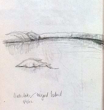
I thought I'd share some random pencil sketches I had done.  This first one was from a camping trip to  Crater Lake.  It is beautiful ... no sketch will be able to capture its beauty.  If you haven't seen Crater Lake follow the link.


When you can't find anything else to sketch, sketch your hand.... right?  By my notes it looks like I was sketching my hand in preparation for painting my hand for a WetCanvas! (a website for artists)  project.


These are really 2 sketches from this one page in my sketchbook.  The top one is looking out at the Pacific Ocean and sketching some small waves coming in ... with gulls in the air.  Below that is looking  over a bay toward some homes that overlook the Pacific.

I think if you click on the images they might enlarge if you can't see them well enough as they are.

It is really fun to look back at my sketchbooks and remember when we were here or there.  And to think I really did remember to bring my sketchbook and do some sketching.  Now that is amazing!
......................
On another note .... have you tried using the new 'Search this Blog' gadget on the upper right of this page?  A fun new feature.

Thursday, May 30, 2013

The Art of a Sketchbook - Friday

First pages ....

Are you usually intimidated to start a new sketchbook / journal?  I am.  I've tried a few different ways to start that help ease me into continuing to use my sketchbooks.  Since most of us find it difficult to start using those nice clean white pages, this week I thought I would share a few of the first pages of some of my sketchbooks this week.


I decided I would start the above sketchbook as if it were a regular book.  I felt I would use it mostly while we are off on our boat so I picked the word Journeys for the first page.  Then added a pencil sketch of a sail boat.  I liked this idea and by starting off this way I never did have a feeling of intimidation.


Obviously I must have started this sketchbook in the Spring.  I was going to use each page with this type of entry.  That didn't last.  I randomly started putting anything on the pages that suited me at the moment.


Because I usually feel intimidated when starting a sketchbook I thought I'd start right off with an affirmation  I had cut out of a magazine and a printed photo of one of my previous watercolors.  This was a good way to start also.


One of my handmade sketchbooks I've dedicated for travel.  We were going to take a cruise to Mexico and I started out the sketchbook with a colorful watercolor.

How do you start you sketchbooks?  do you just open them up and dig right in?  Have you ever done something more special for your first page?

Wednesday, May 29, 2013

The Story Teller, Revisited ...

Re-visited -The Story Teller, 6" x 6" oil, © 2012 Nancy Van Blaricom

Back in November (2012) I posted this painting of The Story Teller.  Although I had shared it with you then later after living with it awhile I thought it needed more work, so, I recently re-visited this painting.

I've worked on the coloring on the face, the eyes and added the hint of an eyebrow (I some how must have missed that the first time) I also worked a little on her mouth. Although you might not have been able to immediately see a difference in this painting I think you will now that I mentioned them to you.

I should have put in some close-up shots so you could see the changes I made better ... next time.
................

On another note: I've recently added a "Search this Blog" gadget to my blog ... you'll find it in the upper right hand corner.

I've always loved it when other artists have this feature on their blogs and I can look for a certain painting or subject I might have seen previously.  For instance when writing this blog post I couldn't remember offhand when I had posted this painting.  I simply went to the "Search this Blog" entered  The Story Teller and the information popped up immediately I could easily place the link from the original posting to this blogpost.

I hope if you've found something in a previous post you would like to see or read again so that you will use this new feature.  Enjoy!

Thursday, May 23, 2013

The Art of a Sketchbook - Friday


For my sketches this week I chose to share a couple of tubes of paint I had sketched.
This is a tube of Gamblin Titanium White. 


The sketch above is of a Rembrandt tube of paint.  
I didn't write down the color but I'm guessing its Permanent Red Medium.
Its always fun to try and sketch the dents and twists of a used paint tube.

If you haven't tried sketching older paint tubes them give it a try.  I find I
really need to concentrate on just what I am seeing.
................


This is a piece of sandstone rock I found a few years ago.  
Isn't it neat the way its shaped like a cat?  Isn't it amazing when you
can find things in nature that takes on the shape of something else?
................
On another note: I've been busy finishing a commission and now I'm organizing my oil painting photos into jpg's and tiff's in different sizes so they will be ready when I need to print or share on the internet. Even though I haven't been oil painting a long time this has proved to be a much larger project than I expected.

As soon as I finish this project I want to revisit some of my oils that I think need just a little more work to become better paintings.  I usually paint something then as time goes by I think "this is a nice start but it needs to be finished. "  I want to finish some older work.


Thursday, May 16, 2013

The Art of a Sketchbook - Friday

Looking through my sketchbooks I realize that most of my sketches are objects.  A hair brush, flower pot, some shells ....


This is probably because when I'm inside I am more likely to have a sketchbook nearby and I can easily find something to sketch that is close at hand.

Most of the landscapes and waterscape sketches in my sketchbooks are from when we are off boating or camping.  I don't seem to have many from outside around my home.   Maybe I'll concentrate on doing more local outdoor sketching during the next few months.   What about you?

Sketch from Anette Bay, southern gulf islands, Canada

 Do you sketch landscapes scenes from near your home or do you sketch when off on vacation mostly?
 ...................
This time of year the sun doesn't always shine here in the Pacific Northwest. But, when I come into the room and sunlight is making shadows on the wall in May it always makes me smile.


Thursday, May 09, 2013

The Art of a Sketchbook - Friday

I'm not sure if this post is more about color or the sketch, but color definitely is playing a big part of this blog post.

Most of the time I sketch with pencil.  Just a plain ol' Ticonderoga #2 pencil we have all used one time or another. There are times I will use my drawing pencils but not as a routine.

With the sketches below I used the #2 and then used watercolor to emphasize certain things.

Living room sketch, with color, pencil & watercolor, © Nancy Van Blaricom

In the above sketch I used color on some things then left the rest alone.


Into the hall sketch, with color, pencil & watercolor, © Nancy Van Blaricom

Same as the second sketch with the sailboat  ... most of it is in pencil then just a hint of color.  
I like the look of color on a pencil sketch, it adds a little pazazz to a sketch I think.

Living room sketch, with color, pencil & watercolor, © Nancy Van Blaricom

This last sketch was just an experiment and it failed miserably.  I didn't like it at all.  The colors make it cold, and uninviting.  

If I were to re-sketch this I would leave out the lavender, a light shadow I thought.  Also I'd leave out most of the yellow that was emphasizing light and maybe concentrate my color mostly on the rug and maybe a pillow ... or maybe one of the vases along side the couch.

If you give this a try in your sketchbooks I think it may be wise to be selective with the colors you use as well as the amount of items you color.   

Even with an occasional mistake its still fun once in awhile to add just a touch of color here and there. Go ahead, give it a try.

Friday, May 03, 2013

A week-end full of art ...


This last week-end, April 27th, I was fortunate to see two exciting Seattle museum exhibitions.  The Seattle Art Museum was showing works of Gainsborough, Hals Reynolds, Romney, Turner, Van Dyke & Rembrandt, and The Frye Museum was showing works of Nicolai Fechin .  You can read more about Nicolai Fechin here on Matthew D. Innis very informative blog "Underpaintings.  

All the work was amazing but at the Seattle Art Museum I was most amazed at all of the Rembrandt etchings on display.  It was impressive to see so many at one time.

At the Frye Museum they are showing 55 paintings and drawings of Nicolai Fechin.  His work is also awe inspiring.  He used thick paint with purposefully placed brush strokes. If you get an opportunity to see his work do not hesitate.

I felt so fortunate to be able to see all this great work and to see it all in one week-end was amazing.


Thursday, May 02, 2013

The Art of a Sketchbook - Friday


Two sketchbook pages done in the same style where I have added a lot of words to the sketch.

On the top sketch I've written about how little I produce, what I wish I would have done to this sketch, and also what the weather was for the day.


In this sketch I wrote about my thoughts of how I would like to paint this scene ... also what this sketch was all about, and how I would sketch it next time.

There seems to be no consistency with my sketchbooks.  Sometimes when I look back through my sketchbooks and I see how different each page can be and it drives me nuts that there is so much variety in the way I use my sketchbooks ... but, it doesn't seem to make any difference, I keep doing each page different.  How about you?  do you work in your sketchbooks in a regular method?

Wednesday, May 01, 2013

A Class on Mastering Painting Fundamentals

An assignment on Values.

If you've been following my blog for awhile you may remember that I felt it was time I went back to the basics.  A refresher course, so to speak.  Along with my own study and reading up on the basics I also signed up for an on-line class that Elizabeth Floyd was offering awhile back on Mastering Painting Fundamentals.  Elizabeth made the 4 week class such an enjoyable way to refresh the basics.  She has made me realize more than anything that I need to pay attention to my work and take the time to 'see'. A goal of mine is to become more proficient as an artist and this class has reiterated that goal. Make sure and check out all the classes she is offering.