 Another sketch from my sketchbook. I used ballpoint pen to sketch it out and watercolor from my small traveling palette. I love the bright colors of this IKEA umbrella. It even makes a rainy day more cheerful. I thought an umbrella sketch seemed very appropriate considering all the rain we've received lately. I added the color splashes after I finished the sketch and I think this time they took on a look of rain drops.
Thursday, April 02, 2009
A watercolor from my sketchbook
Another sketch from my sketchbook. I used ballpoint pen to sketch it out and watercolor from my small traveling palette. I love the bright colors of this IKEA umbrella. It even makes a rainy day more cheerful. I thought an umbrella sketch seemed very appropriate considering all the rain we've received lately. I added the color splashes after I finished the sketch and I think this time they took on a look of rain drops.
Tuesday, March 17, 2009
The last of my bird series ...
 Common Merganser: watercolor 5" x 5"
I think, for now, I'm done with my bird series. I find it hard to concentrate on painting the birds with my usual uptight detail painting style if I'm also wanting to paint more loosely.
I also have another painting started with the drawing down on the watercolor paper and some whites saved with masking fluid, but now I'm anxious to try to paint it looser than normal tendency's. Wish me luck.
Saturday, March 14, 2009
Thumbnails and value decisions
Today while sitting in the house looking out at the rain coming down I thought how nice it would be to be out painting en Plein Air on a sunny day. As I was looking out the kitchen window I noticed the contrast between outside and inside the house. I grabbed my 50% grey Prismacolor Pen and a black Sharpie to sketch the contrast in value's.
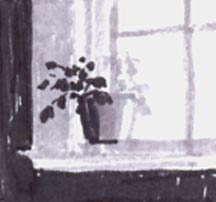 In this sketchbook photo I used the white of the paper for my whites and lightest values, then the 50% grey pen for the next value, and lastly the black Sharpie to indicate the shadow/darkest value.
 I painted this using only my value sketch as my guide. This was an enjoyable exercise for me. I really had to think when choosing my colors that were back lit and in shadow. I'm not sure I did a good job of showing this, but when I converted this watercolor to black and white, below,

it seems pretty true to my original value thumbnail.
 In this sketchbook photo I used the white of the paper for my whites and lightest values, then the 50% grey pen for the next value, and lastly the black Sharpie to indicate the shadow/darkest value.
 I painted this using only my value sketch as my guide. This was an enjoyable exercise for me. I really had to think when choosing my colors that were back lit and in shadow. I'm not sure I did a good job of showing this, but when I converted this watercolor to black and white, below,
it seems pretty true to my original value thumbnail.
Saturday, February 21, 2009
Start to finish Watercolor
 SOLD
SOLD Jarrells Cove Store-watercolor 8" x 10"
I decided to put contour (modified) drawing and paint to a test. I wasn't sure if I would be able to make a complete drawing using the contour method and have it resemble anything when I completed the painting. I tried to use a loose method, which is always a challenge for me.
 This is my reference photo. This is a little store at a nearby marina. There is a lot of green going on, but still l like the photo.
 I ususally don't take advantage of thumbnail work, but decided I'd try a few, working out my values and colors.
 This photo above is where I stopped. I let it set a while wondering where it was missing "something".
This is the same as the first photo....... finished after adding some value here and there. I am pretty happy with the results of my drawing. It may not be photo realistic but it has something I am pleased with. I wish I had taken a photo of the drawing before I added some pigment. I will definately continue with my contour drawing.
Sunday, February 08, 2009
The last of the sketches ....
 for awhile that is. I did these two pages in my sketchbook on the 5th of this month. This time I had added some line shading to a couple on this first page and some watercolor to this second page, the sketch below.
 Sketch of my husbands feet on the reliner - as he naps
Working from Charles Reid's book still, I am now into the section were some measuring is suggested. As I start measuring I think that will make my sketches more recognizable. Still, even in these latest sketches I notice that I'm not taking my time when I sketch, as I would normally. True contour drawing, where the artist focuses on the outline of the model and not taking their eyes off the subject ... convinced that the pencil is touching the subject you are looking at, is different than what I'm trying to do here. I am doing modified contour drawing where I glance at the drawing at intervals noting relationships of sizes lengths ... and angles.
Lin had asked in my last post, "how do you turn off your 'it's wrong' mind???!! ". Wonderful question Lin. After my first modified contour sketch, I was thinking 'I recognize this, but as far as looking like the subject, it looks like a 2nd grader sketched it (no offence to those 2nd graders), then, almost in the same breath I said....... that's what this work is all about, learning to see and draw with out getting the proportion's perfect. Exact proportions would defeat the purpose of me doing the contour drawings. The contour drawing should add life, excitement and joy to my work. Hope this helps Lin. I guess it's just my personal journey at this time, *wink.
Just noticed that where I've placed the date of the sketch in the top photo, I wrote 2-5-08. Geesh, it's a little late for me to still be hooked on 2008 isn't it?
Friday, February 06, 2009
Contour Sketch - from an older photograph

I decided, still reading from Charles Reid's book "Pulling Your Painting's Together", to attempt his first assignment in the book. He suggests we find an older photograph with diffused light ... (I've tweaked this photo in Photoshop so you could see it) and start drawing outside shapes. Then also try drawing only the inside shapes I see. After my attempts, I can't say it looks like the photo, but it is "expressive". He suggests that you try doing the same drawing numerous times. I think that I need to pay attention when I attempt something I've read in a book. I forge ahead and do not read it thoroughly. I was suppose to, in the second assignment, avoid drawing outside contours. Just keep my pen on the paper as much as possible and concentrate on the shape. Show small details in some places (where you want people to look) and leave them out in others. Seems it was all or nothing with me on this one ... *wink.
Thursday, February 05, 2009
Another Contour sketch

This time I found my prop in the pantry. I chose this Folgers Instant Coffee jar because of the bright recognizable container . To keep this from getting too serious I decided to do this sketch standing up with the sketchbook in one hand and my pen in the other hand. I didn't spend time with measurements. I wanted to get down some lines, keeping my pen on the paper as much as possible and not trying to make this a "correct" drawing, yet, as Charles Reid says, make it an expressive drawing. I think while it may not be accurate I've accomplished what I set out to do.
I find contour drawing so freeing. In researching contour drawing the other day in my art books I didn't want to sit down and work in my Nicolaides - The Natural Way to Draw book or my Drawing on the Right Side of the Brain or my Key's to Drawing book .... but I did remember seeing in my books by Charles Reid's his wonderful contour drawing approach. A year ago or maybe two now I purchased his "Pulling Your Paintings Together" . In the beginning on page 9 he says "When you do a contour drawing, you must think of your pen or pencil as being on the model, not the paper. You must concentrate totally on the model, the drawing itself, good or bad, doesn't matter. This doesn't mean that you're slashing about with your pencil. On the contrary, you're working slowly, with great care, totally absorbed in your subject. For once this communion is gone, you will never have more than a passable drawing." "In contour drawing, it's also important to attach the subject to background shapes with out explaining all the subjects boundaries. " In this sketch above, I decided afterward to show some magazines and binders that were on the table .. as well as the edge of the table. All too late I think. I'll take note and try to remember this in future contour drawings.
For now, I am thinking I'll work through this book. Maybe you can expect a book review in the future.
I have a lot of trouble getting my scans to show the light colors in my sketches and watercolor paintings. For instance, the light shadows past the shadow you do see ... I've tried just about every thing I can think of. Do any of you have this trouble?
Monday, February 02, 2009
Monday's watercolor sketch: contour hydrangea

It was a beautiful sunny day here today yet still this morning a little cool at 38 degrees. With the sun shinning I wanted to sketch this hydrangea plant someone had recently given us. I did this contour drawing in my Aquabee 6" x 9" sketchbook using my Noodler's Ink and Lamy Safari pen and finished with some watercolor washes. Although I didn't see any pink in the blossoms I found I kept wanting add some to the white petals I saw. What I did see was GREEN. The leaves were a variety of greens, the cellophane around the plant was clear with some green swirls and the white blossoms had an occasional green flower petal. I think it would be wise for me to make some green color charts so that I can reproduce the greens I see.
Monday, January 26, 2009
Monday's watercolor sketch

Today I decided on the second photo that Karin Jurick offered on her Different Strokes blog. I really liked this photo, the relaxed feel of the beach and the sand... the sky... all of it, but even with doing this sketch, I wish I would have slowed down some and given more thought to what I was painting ..... maybe next time.
Sunday, January 25, 2009
A Sunday Sketch: Jack
 Today was a good day to look through some reference material for something that might motivate me to sketch or paint. I found a photo that Karin Jurick offered to artists as her week #1 challenge. I haven't been able to keep up with these weekly, or bi-weekly challenges lately, but thought I'd try sketching her dog Jack today. Can't say that I think this looks anything like the photo, but I like that I was able to retain the looseness I was after.
Saturday, January 24, 2009
Plein Air with a twist
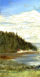
These two works are really from one original plein air painting I did some time ago. I was never happy with the painting but for some reason I didn't throw it out like I should have. I had seen a painting in a gallery that had a similar treatment done to it where with every tonal change on the painting a gold line was drawn around it. (I wonder if the artist was as unhappy with her painting as I was with mine?) It was really quite attractive so I thought I'd see if I couldn't save this painting by trying the same method.
 I didn't like the original composition so first I divided the painting in two and found I liked them each better apart than one painting, then used a gold gel pen to show the tonal changes. I don't think it helped the painting much but I did enjoy the process. Click on the bottom photo to enlarge, for some reason the other photo doesn't ... not sure why.
Friday, January 09, 2009
Sketch: Another House
 Another House - using aquabee
 6" x 9" sketchbook
I'm still enjoying the 'no pressure' sketching. I decided I'd once again to use my sketchbook for some watercolor sketches, but each time I'm sorry because the paper isn't made for a lot of washes. I think I need to write this in the sketchbook in large letters because I always forget that.
Monday, January 05, 2009
Sketch - Sailboat on Buoy
 Sketch - Sailboat on Buoy, 4 1/2" x 5"
Going through my reference photo's this one caught my eye. I was still using my 'no pressure' talk to myself, but found I was starting to get a little nit-picky. This was actually sketched on Sunday but didn't have time to post it.
Again yesterday afternoon we were hit with at least an inch of snow. This caught most of us off guard, but I was already thinking I should take some more photo's of the snow. Fortunately when I awoke this morning it was just about all melted.
Sunday, January 04, 2009
Sketch: Near Chesapeake and Lagoon

Near Chesapeake and Lagoon, 4" x 4 "
watercolor sketch on Arches scrap
This house looked cozy with a light dusting of snow covering the roof and ground. I seldom draw buildings but sketching and telling myself 'no pressure' made this fun to get on paper. After, looking at it on-line I'm not sure now if I was able to properly indicate snow. Also, the odd shaped roof and the angle I took the reference photograph made the perspective a challenge ... but, I really had fun painting this.
This is another scrap of paper I had taped to the same piece of foam-core as the last sketch. After painting these two sketches I'm finding these small scraps of paper are fun paint on and allow me to lighten up and paint more loosely. I'm now looking through my paper pile to find more.
Friday, January 02, 2009
Winter Snowfall
 Winter Snowfall 3" x 4" Arches Watercolor Paper
After receiving snow the night before we were happy to see sun shining on the newly fallen snow as we took our daily two mile walk.
I'm trying to get into the habit of sketching with my watercolors. This was done on some Arches 140 lb. coldpress watercolor paper I had taped to a piece of foam-core earlier last year. I'm pretty stingy with my paper, never wanting to waste even a small piece.
Sunday, December 28, 2008
December Bear Sketch
 Holiday Bear on cardstock
Today as I go through the house picking up a few of the holiday decoration's to put back in stroage boxes, I gathered up this bear and his female counterpart that I had sitting on the couch. He's been with me a number of years and I've often thought of painting him but never took the time. Today was a great opportunity. Darn, why didn't I paint it on some nice watercolor paper? Freedom comes easier when there isn't the pressure to make it perfect, don't you agree?
Are you thinking of some artist goals you'd like to accomplish this next year?
Are you taking stock of all your accomplishments this year?
Sunday, December 21, 2008
December 21st, Winter Solstice

This first photo is from the very north end of the island, looking toward the main land and a couple of other islands.


The second photo is from about he same spot yesterdays photo was taken from.

And the last photo is looking out our front door and you can see the snow that accumulated on the red chairs and the top of our fence. When I measured our snow accumulation I found aprox. 6 inches on my deck.
This is Winter Solstice!
Saturday, December 20, 2008
Almost winter solstice ...
 I thought you might like to see this photo I took yesterday about 10:30 a.m., on my daily 2 mile walk. Today on our walk we saw less sun, and we are seeing more accumulation of snow ... but it is still beautiful. How appropriate having snow so close to Christmas.
.....walking in a winter wonderland.
Thursday, December 18, 2008
Bad timing ...
 This photo shows the center of the room, while the bookcase is being painted.
 As you may remember, in my post earlier this year on (August 16th), I did a lot of cleaning and eliminating of unused items in my studio. I still feel as though I'm pretty crowded and want to get rid of even more stuff from the studio. I've emptied my book case and painted it white. I've left this book case unfinished for years - and now, during the holiday's, I feel the need to paint it,...bad timing. This gives the bookcase an illusion of looking like there is more space and not stopping the eye with a darker look of unfinished wood. I've also taken out my artists type drafting table to give me more room and I will try to get by with the storage table you see here to paint at. Also, I'm thinking of adding a little more color in this room with a valance over the window, leaving the walls white ... but why the urge to do this now.? All of this is really bad timing don't you think?
Hopefully soon I'll be finished with this project and it will inspire me to use my watercolors once again.
Happy Holidays
Wednesday, December 03, 2008


Subscribe to:
Posts (Atom)